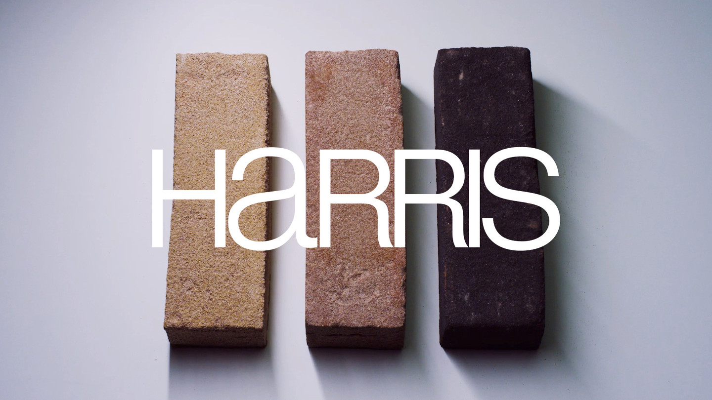
Harris
Brand. Visual identity. Digital
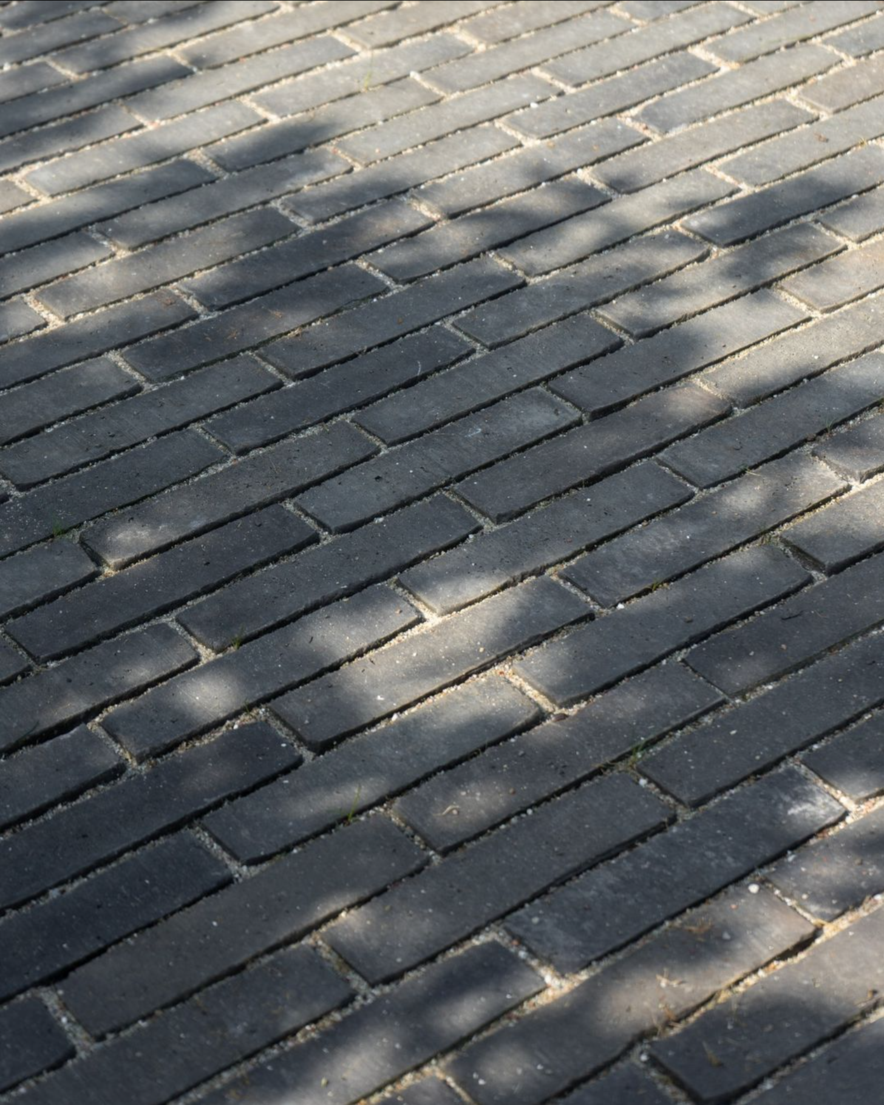
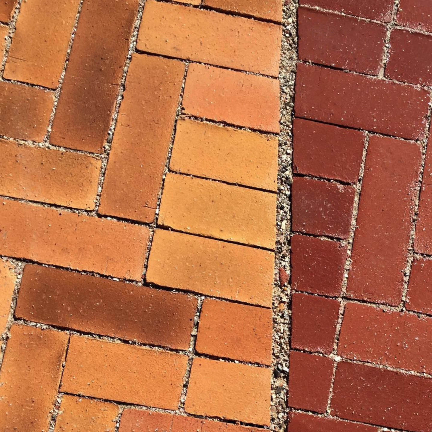
Harris is a high-end brick wholeseller supplying the nordic region with handpicked quality products. We did the full rebranding.
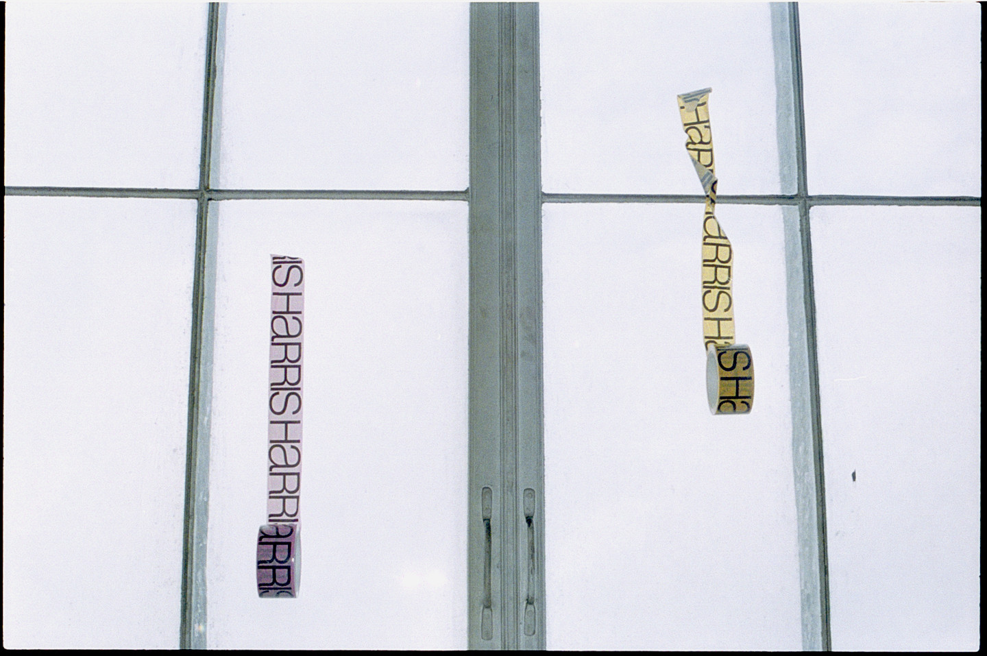
Brand
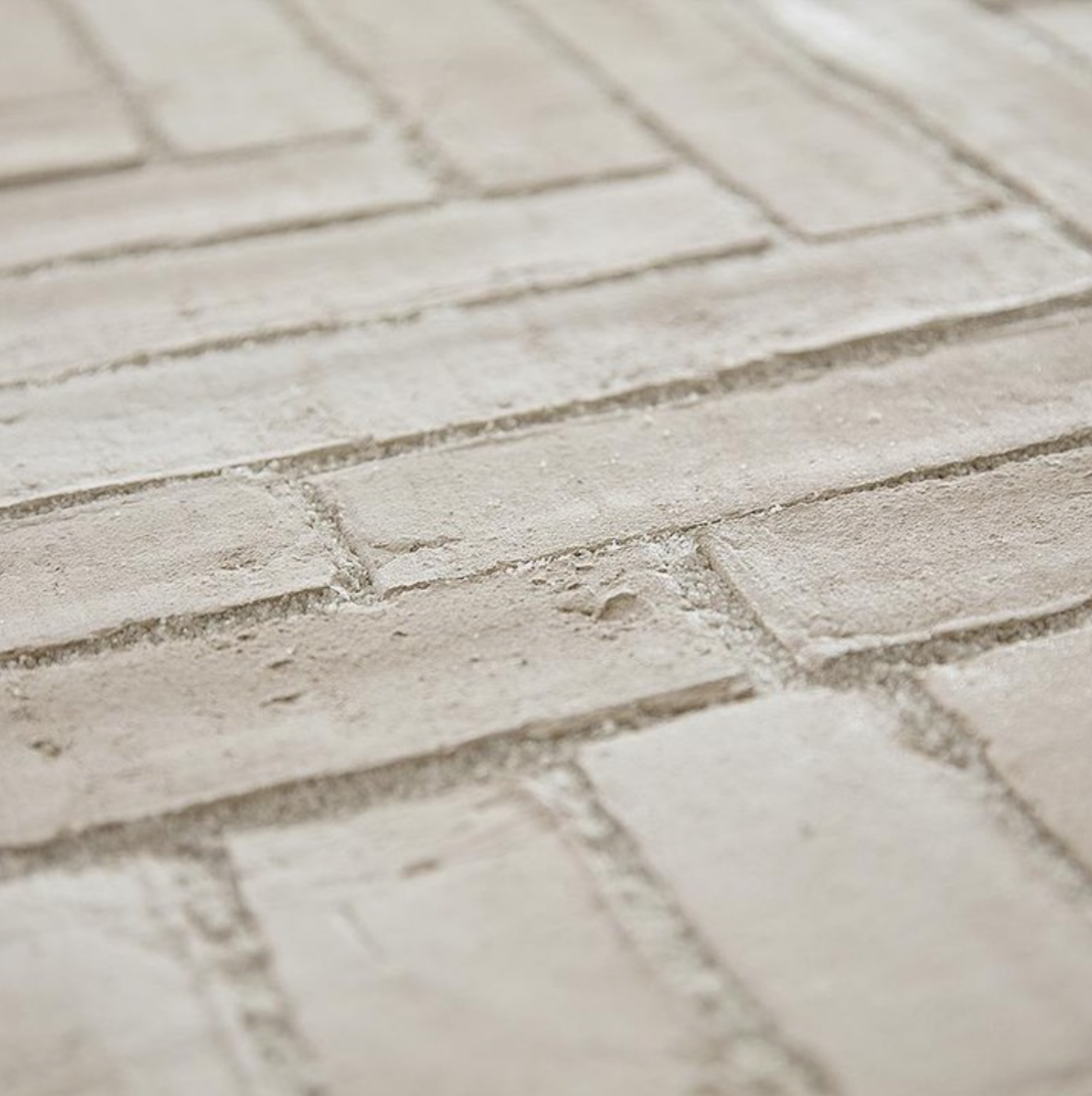
The entire brand experience is a highly controlled clash between the straight and the crooked.
Brand film
The brand film ignites the Harris brand and makes the world of bricks come alive.
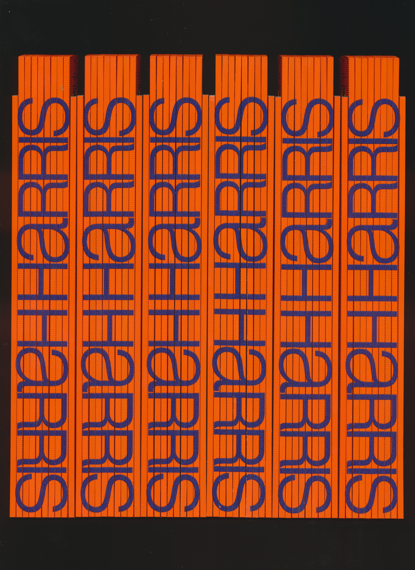
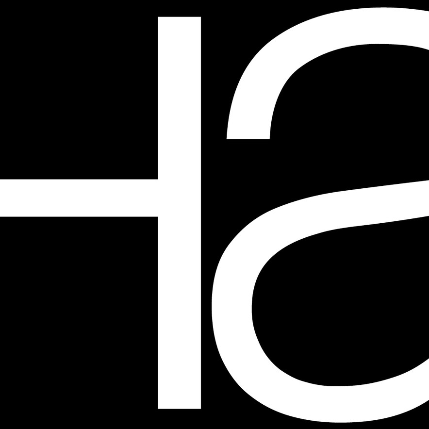
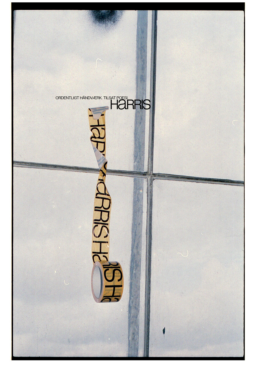
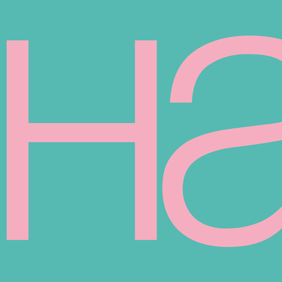
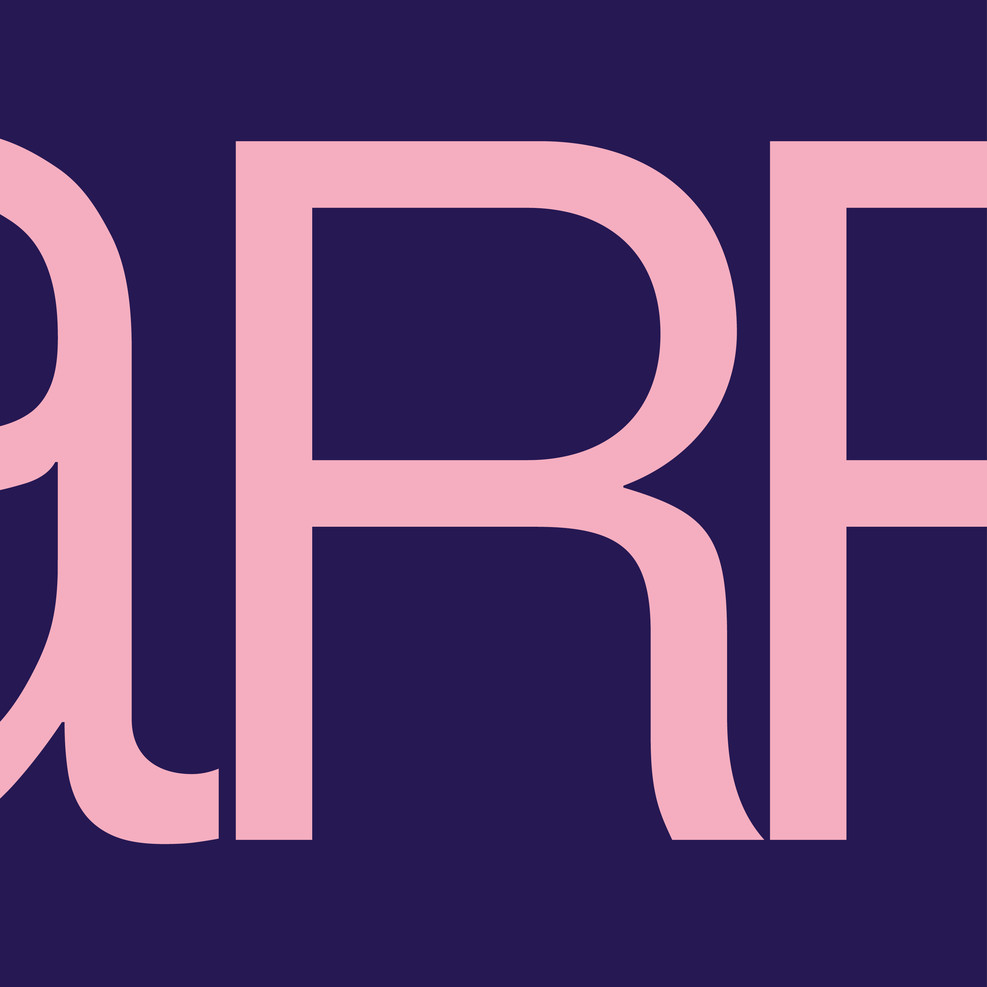
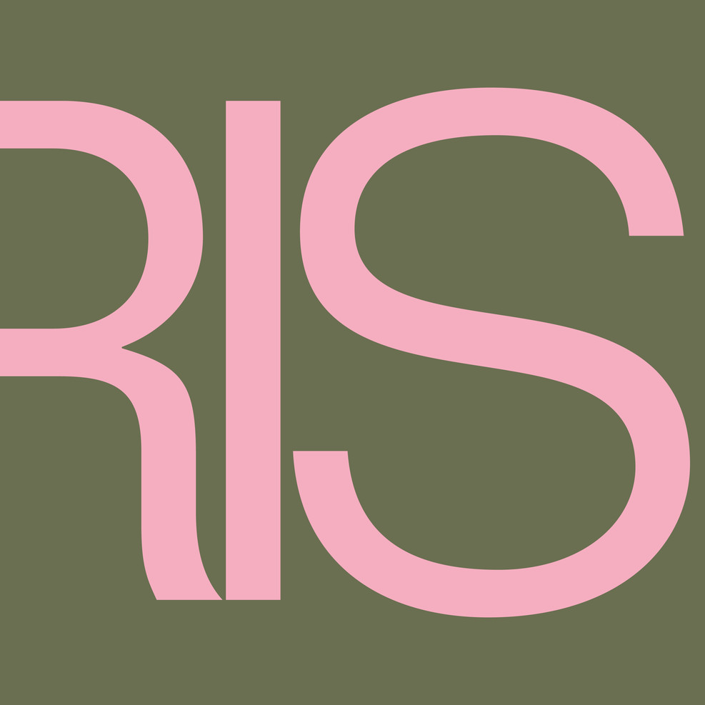
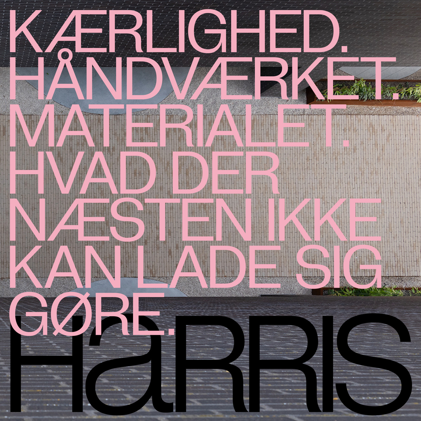
The logo name
The logo name is all aligned but something catches the eye. The lowercase "a" challenges the otherwise uppercase dominion.
The website
The website embrasses meaningful vertical scrolling subtly hinting at brick laying techniques.
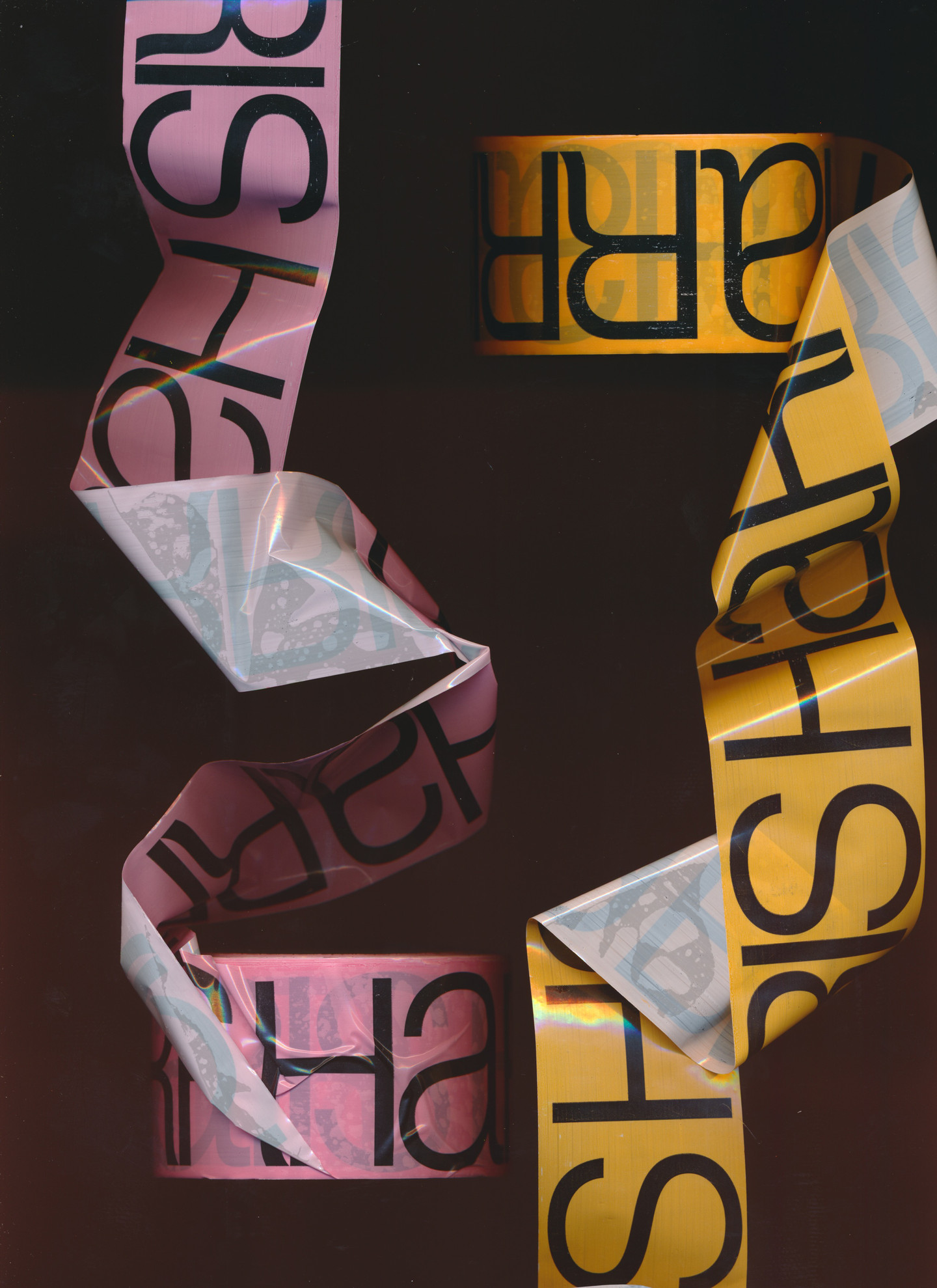
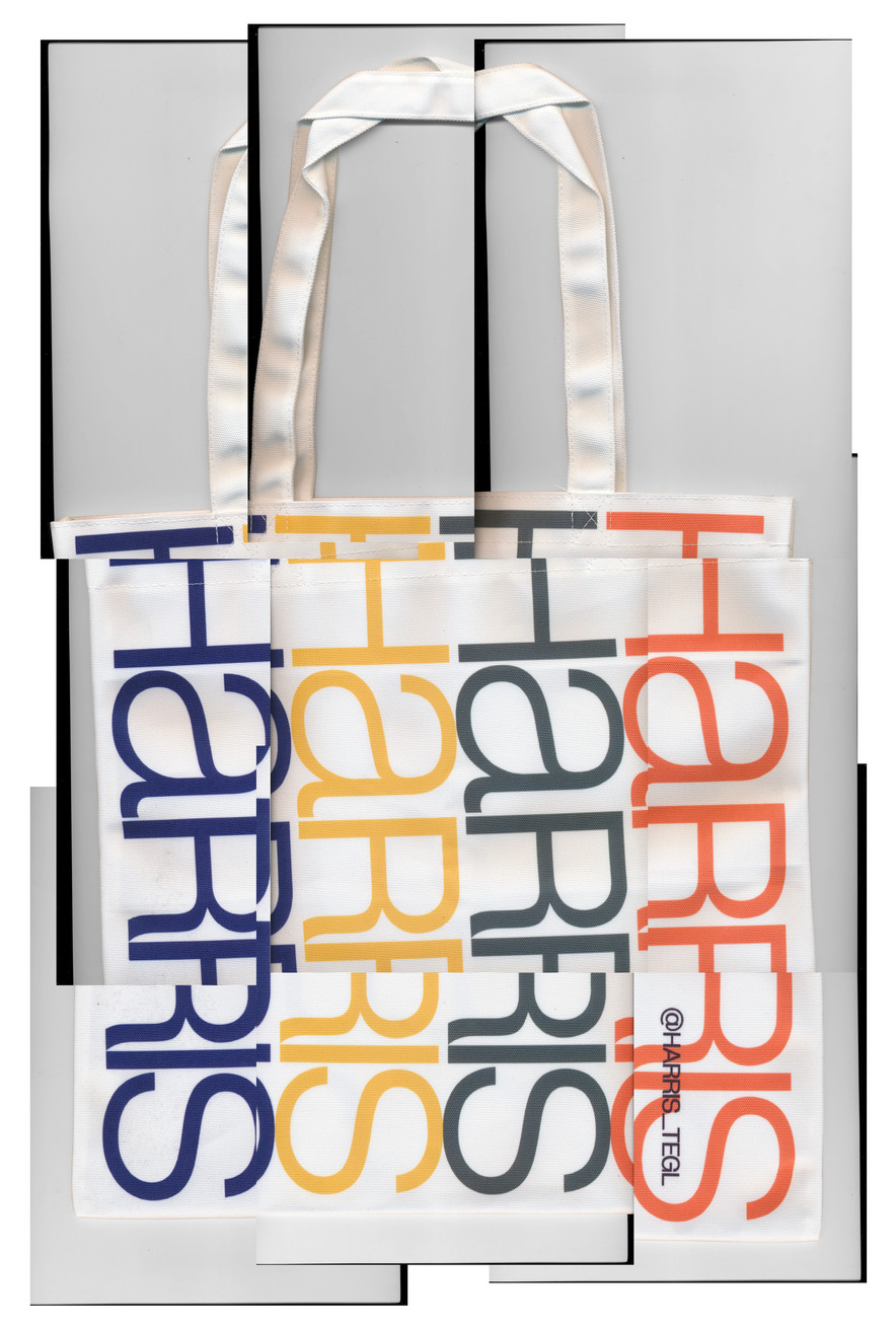
Colors
Colors are happily contrasting the brick's earth tones - and ment to roam deliberatly.
Who knew bricks could be this sexy?
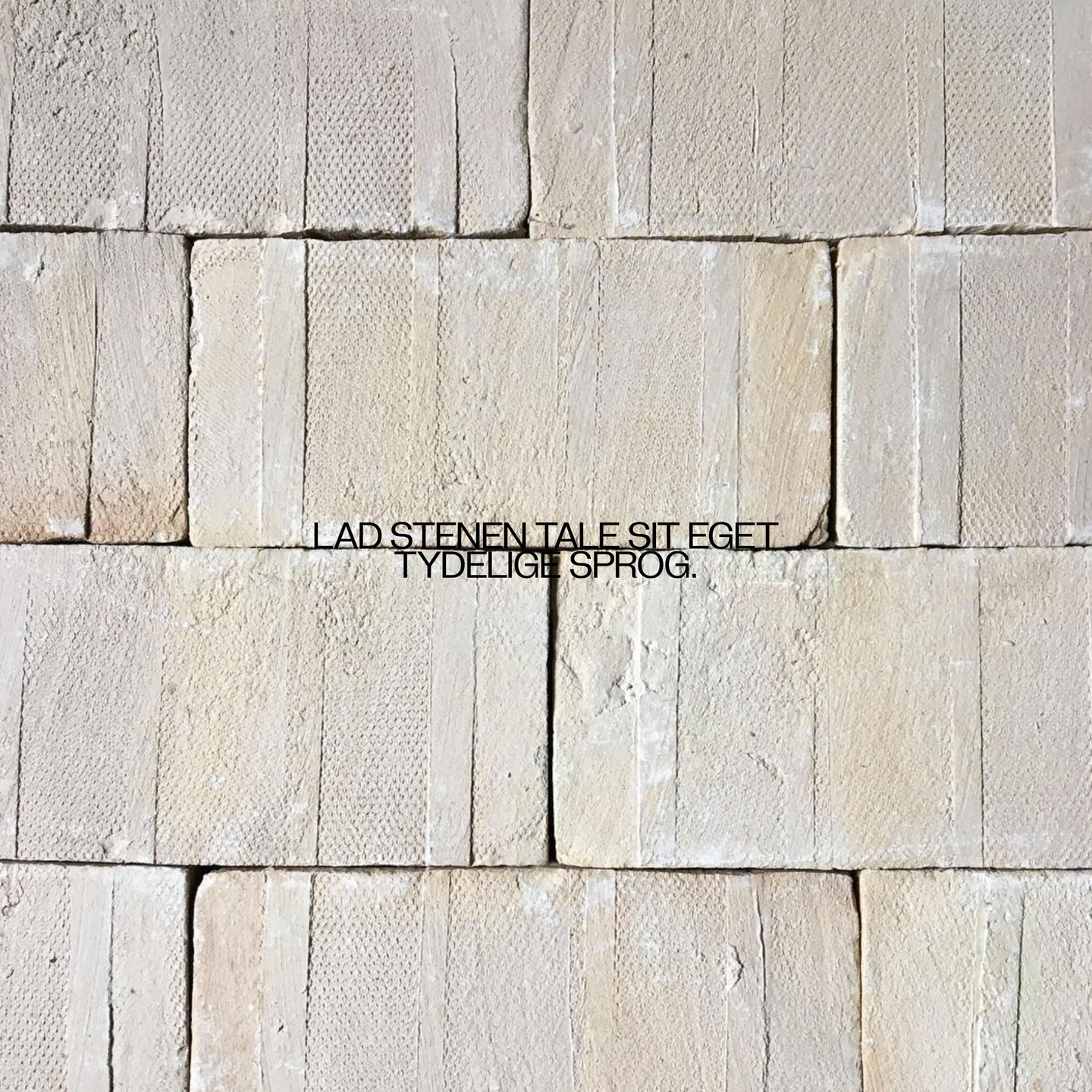
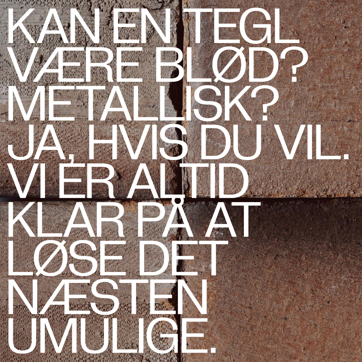
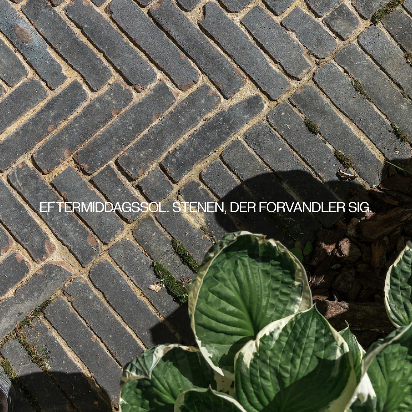
Copy
A layer of bright and beautiful copy is activated on top of serene photos of brickwork.
of